
Mixing Hammerite Paint sounds obvious once someone says it out loud, but for quite a while it genuinely did not occur to me. I needed a pale green for a restored Abwood milling vice, and later for my hand shaper project, only to discover that the standard Hammerite range is mostly what I would call sensible garage door colours.
Very practical, no doubt. But if you want something a bit more cheerful, or simply need to match an existing machine, that range starts to look rather limiting.
The good news is that Mixing Hammerite Paint is perfectly doable, provided you understand two things: which paints are compatible, and how to work your way toward the colour you actually want. Once you’ve got that straight, making a custom shade is not difficult at all.
Why bother mixing your own colour?
If you are painting railings, gates, garage doors, or bits of outdoor metalwork, the stock colours are probably fine. But workshop machinery is another matter. Old machine tools often turn up in shades that modern off-the-shelf paints simply do not match.
That was exactly the problem here. I needed a pale green, and not just any pale green either. Something close enough to the original machine colour that it would look right without descending into the madness of concours-level colour matching.
That is where Mixing Hammerite Paint becomes useful. If you can get the right base colours in the same paint system, you can make a surprising range of custom shades yourself.
What paint actually is
To understand why some paints can be mixed and others cannot, it helps to know what paint is made from. Broadly speaking, paint consists of two main parts:
- Binder a clear medium that forms the film and gives the paint its strength
- Pigment the coloured material that gives the paint its colour
The binder is what determines the type of paint. Think of it as the paint’s underlying chemistry.
For example:
- In watercolour, the binder is gum arabic
- In acrylic paint, it is an acrylic polymer
- In oil paint, it is typically linseed oil
- In Hammerite, it is likely some sort of resin system, commonly thought to be alkyd-based
The pigment is the coloured bit, and pigments are often quite similar across different paint families. Titanium oxide, for instance, is a very common white pigment whether you are looking at artists’ paint, house paint, or industrial coatings.
Why some paints mix and others do not
This is the important part. You can generally mix pigments together quite happily. That is the whole point of colour mixing. What you cannot do is casually mix paints with incompatible binders.
So:
- Oil paint mixes with oil paint
- Acrylic mixes with acrylic
- Hammerite mixes with the correct type of Hammerite
- Gloss house paint and matt emulsion are not a sensible combination
If the binders are different, the mixture may separate, cure badly, lose adhesion, or simply turn into a mess. So when Mixing Hammerite Paint, the question is not just “are these colours nice together?” It is “are these paints chemically compatible?”
A short detour into pigments, because they are too interesting to ignore
Pigments have some wonderfully odd history behind them. Many traditional colours were literally ground-up natural materials.
Raw sienna, for example, is named after Siena in Italy and was historically just earth from that region, processed into pigment. Burnt sienna is the same idea, but heated to change the colour.
Lamp black was essentially soot. Ivory black, historically, really could come from burnt ivory, which is not exactly a charming detail. And there was once a pigment associated with “mummy brown”, derived from, yes, actual ground-up mummies.
Paint history can be a bit grim if you look too closely.
Then there is stack lead white, an old white pigment made through a process involving coiled lead, strong vinegar, clay pots, fermenting horse dung, and hay. The chemistry produced white flakes on the lead, which were then scraped off and processed into pigment. Ingenious, foul, and not something one would want as a regular workshop job.
That old lead-based paint still has its devotees in specialist circles, but modern regulations in the UK and EU make it heavily restricted. Quite rightly so.
Can you mix Hammerite colours?
Yes, but with some caveats.
The practical guidance for Mixing Hammerite Paint is as follows:
- Hammerite hammered colours can be intermixed, though the hammered pattern may change
- Hammerite smooth colours can be intermixed, except for smooth metallics such as gold, silver, and copper
- Hammerite satin colours can be intermixed with other satin colours
- Do not mix satin with smooth or hammered
- Do not intermix different finishes
That last point is the key one. If you are using Smooth, stay within Smooth. If you are using Satin, stay within Satin. If you are using Hammered, stay within Hammered.
For my purposes, I was working with Hammerite Smooth, which makes life much easier.
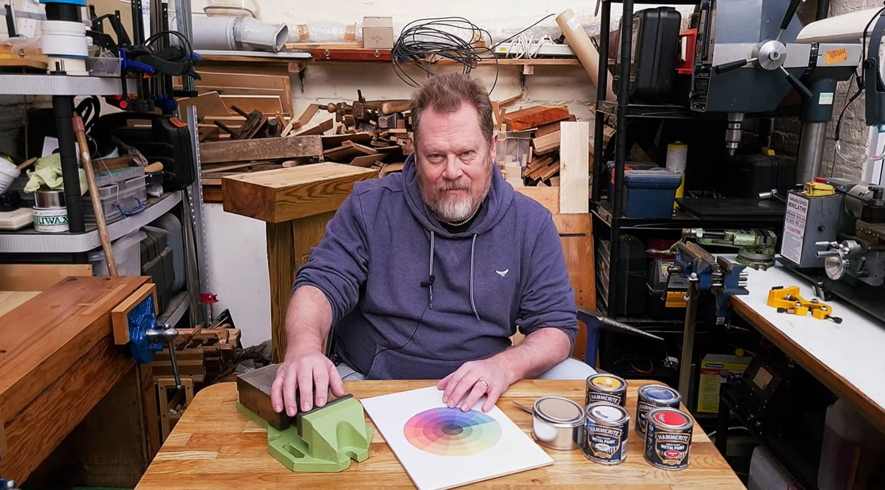
How the colour wheel makes mixing paint much easier
If you are not confident about mixing colour by eye, a colour wheel is enormously useful. You do not need anything fancy either. A printed colour wheel from the internet is good enough to get you in the right neighbourhood.
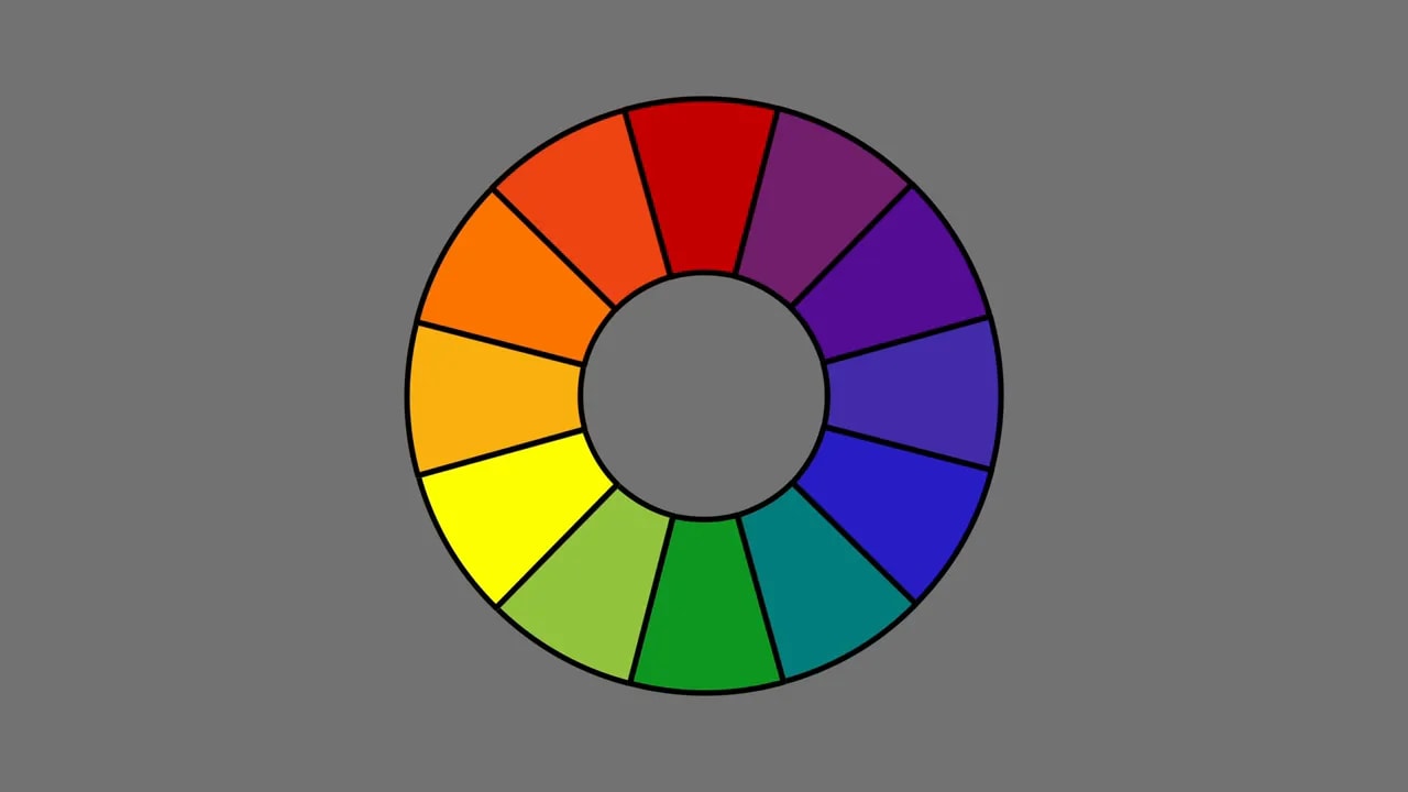
The basic idea is simple. The wheel is built around three primary colours:
- Red
- Blue
- Yellow
Every other colour on the wheel sits between these. To make a colour, find it on the wheel and look at the two primary colours on either side.
For example:
- Purple sits between red and blue, so you mix red and blue
- Orange sits between red and yellow, so you mix red and yellow
- Green sits between blue and yellow, so you mix blue and yellow
That alone takes a lot of guesswork out of Mixing Hammerite Paint. You are no longer chucking random colours together and hoping for the best. You are starting with the right family of colours.
Matching a pale green from an existing machine
The green I was after was close to a machine-tool pale green, the sort of shade that turns up on old workshop equipment. Looking at the colour wheel, it was clearly in the green area but leaning slightly toward yellow rather than toward blue.
That told me immediately that the mix needed to be based on:
- Blue
- Yellow
- And then white to bring it up to the correct lightness
That is the important distinction. Blue and yellow create the green itself. White adjusts the value, making it lighter, though it also tends to mute the intensity a bit.
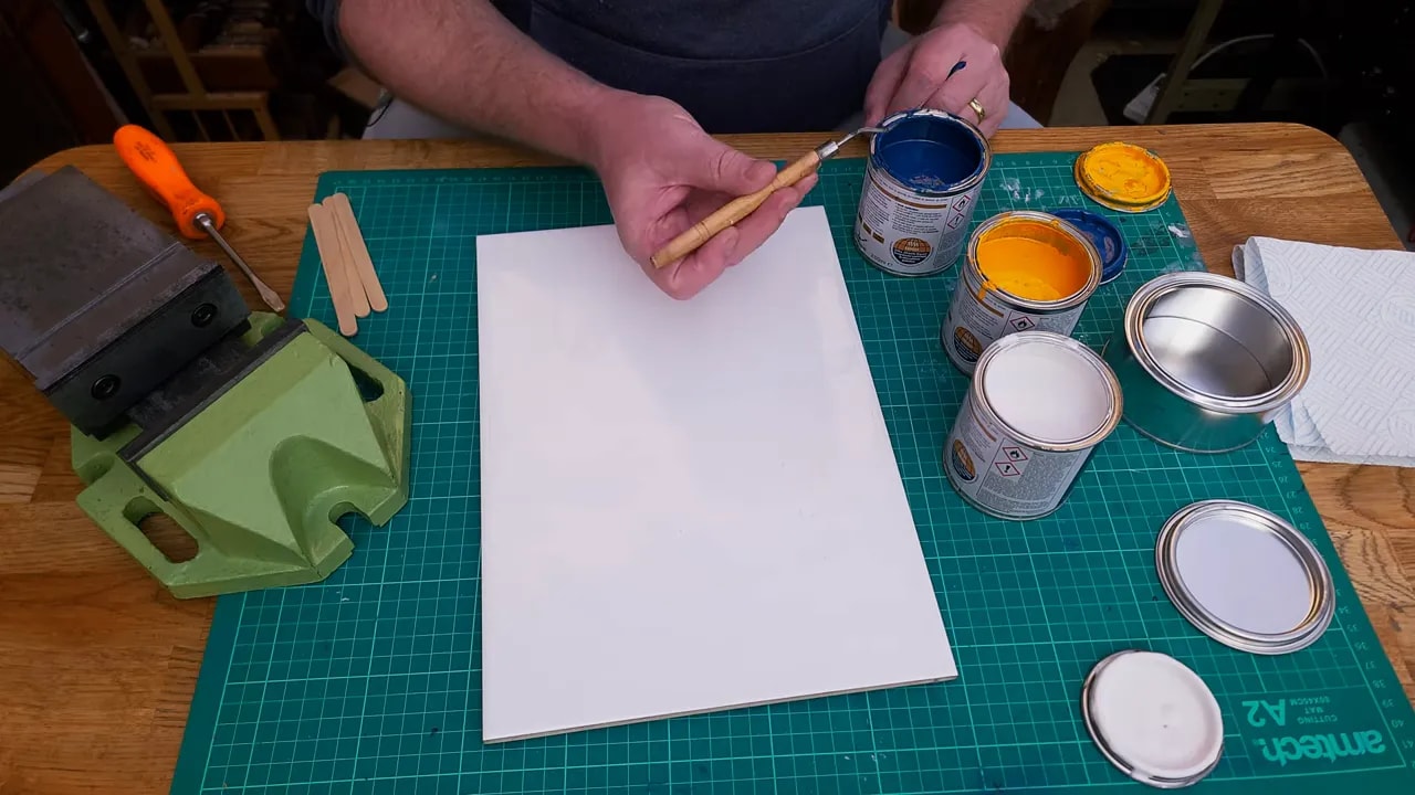
Do a small test mix first
This is one of the most useful habits in Mixing Hammerite Paint. Do not start by pouring half a tin of everything into a big pot and hoping for the best. Paint is not cheap, and once you overshoot, you can end up chasing your tail.
I started with small dabs of blue and yellow on a white tile, roughly similar amounts, and mixed them together to see where they landed.
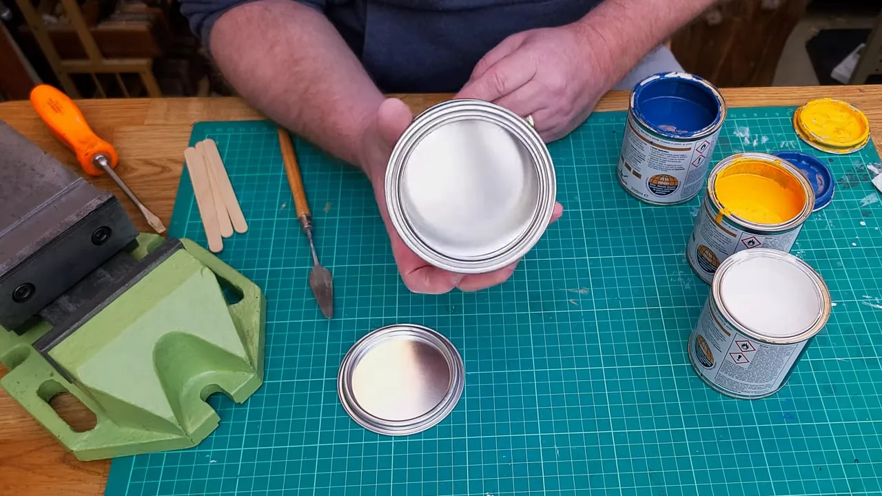
Straight away the result was too dark. No surprise there really. Blue and yellow often produce a strong, fairly deep green. On a white surface it can look darker still, but even allowing for that it was clearly not the pale machine green I wanted.
At that stage there were two possible adjustments:
- Add white to lighten the colour
- Add more yellow to both lighten it and keep some colour intensity
White will make a colour lighter, but it also desaturates it. In plain English, it can make the colour look chalkier and less vivid. Yellow, on the other hand, can lift the green while still keeping it recognisably green.
So the process became a gradual one:
- Mix blue and yellow
- Check the result against the target colour
- Add white if it is too dark
- Add yellow if it needs to shift lighter without becoming dull
- Repeat in small amounts
After a few tweaks, the trial mix ended up in the right sort of range. It was not exact, but it was close enough to tell me the rough proportions.
The small test suggested something like:
- 1 part blue
- 2 parts yellow
- About 1.5 parts white
Not laboratory science, but more than good enough to guide the proper batch.
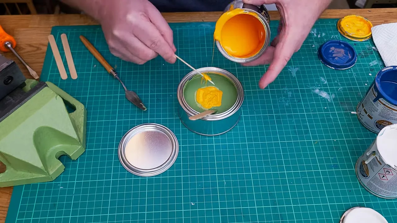
Mixing a full batch in a tin
Once the test mix gives you a direction, you can scale up.
I used a wide tin for this, the sort that is much easier to stir and much easier to get a brush into than the original containers. For workshop use, they are very handy things to have about for paint, oil, and similar odds and ends.
The full-batch process was exactly the same in principle as the test mix:
- Add a reasonable amount of blue
- Add more yellow than blue
- Add a healthy quantity of white
- Stir thoroughly
- Scrape the bottom and corners properly
- Check the colour and tweak as needed
One thing worth stressing is that the stirring matters. It is very easy to think the colour is wrong when in fact you just have blue lurking at the bottom and yellow streaks hanging about the sides. Keep mixing until the colour is genuinely uniform.
The first full mix was actually pretty close. Not perfect, but in the right ballpark. Since I was matching workshop machinery rather than blending a panel on a classic car, “pretty close” was entirely acceptable.
How to make the final colour adjustments
Even when you are close, there is usually a bit of finessing to do.
I tested the paint by lifting a little on the back of the palette knife and holding it against the vice. That quick comparison showed it was just a touch dark, so I added a bit more white.
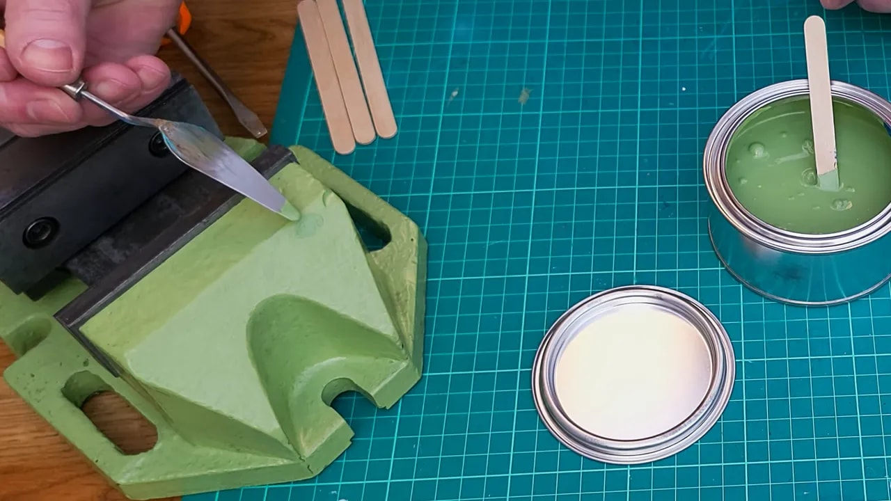
After stirring that in, it looked very nearly there, but perhaps just slightly short of the warmth I wanted. So in went a bit more yellow.
That final tweak brought it close enough to call finished. At some point, you have to stop. Chasing perfection can waste a lot of paint, and for workshop machinery a sensible visual match is usually all that is needed.
The important thing is that the method works. You can home in on the colour in a controlled way rather than simply making a series of expensive mistakes.
Practical tips for Mixing Hammerite Paint
If you want the short practical version, these are the habits worth keeping:
- Only mix compatible paints with the same type and finish
- Use a colour wheel to identify the base colours you need
- Do a small dummy run first before mixing a larger batch
- Work gradually and add small amounts as you adjust
- Use white carefully because it lightens but also dulls the colour
- Use yellow to lift some greens without killing the colour
- Stir thoroughly, especially from the bottom and corners
- Test against the actual object, not just in the pot
- Know when to stop once the colour is good enough for the job
Why the colour wheel is better than guesswork
A lot of frustration in paint mixing comes from starting without a system. If you begin with random colours and no clear idea of what influences the shade, it is very easy to go round in circles.
The colour wheel gives you a simple framework:
- It tells you which colours create the hue
- It helps you see whether the target leans warm or cool
- It lets you make small, deliberate corrections
That is really the whole trick behind successful Mixing Hammerite Paint. Start in the right place, make controlled changes, and do not rush into mixing a big batch before you know where you are going.
The result
The finished mix was a pale green suitable for the hand shaper project and close enough to the original vice colour to look right in the workshop. More importantly, it proved the point that you are not limited to whatever a manufacturer happens to put on the shelf.
If the colour you need does not exist in the standard range, that does not mean you are stuck. It simply means you need to approach Mixing Hammerite Paint sensibly.
Get the right finish, use compatible colours, lean on the colour wheel, and do a small trial before committing to the full batch. With that, you can mix just about any colour you fancy.
Even pale green. Which is more useful than purple Hammerite, if we are being honest.