For those of you that aren’t familiar with it, MDI (Multiple Document Interface) is a technology that used to be included in Microsoft programming frameworks that allowed you to create Windows that contained other Windows. A good example of this would be an application like the older versions of Adobe Photoshop CS or Adobe Reader V6.
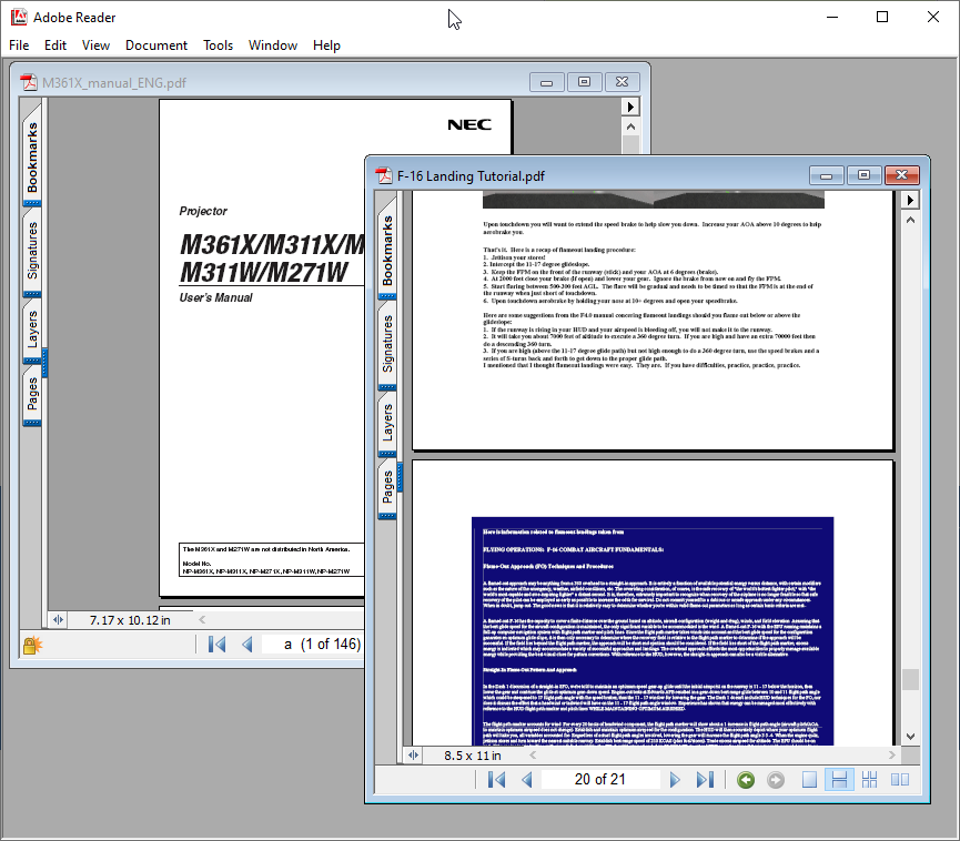
As above you can see that in Adobe Reader 6 you can have multiple documents open at the same time, all within Adobe Reader. This is MDI. This worked well for applications such as Photoshop because it meant you could have many images open within Photoshop all at the same time.
MDI was built into WinForms, which meant that if you wrote a Windows application using WinForms, you could make it an MDI application. Microsoft never really liked MDI, and when they released WPF (Windows Presentation Foundation) in 2006, they took the opportunity to drop MDI altogether.
You might have noticed around that time that Microsoft Office (Word and Excel) stopped being able to open multiple documents, and instead each document you opened, opened in a separate instance of Word or Excel.
This behaviour is SDI (Single Document Interface) which is the opposite of MDI.
Incidentally, you can also have TDI (Tabbed Document Interface) as you would find in most modern web browsers. One tab for each web page.
Ok, so big deal. Microsoft dropped support for MDI after WinForms you might say. What’s the problem with having multiple instances of an application open? Well for a lot of applications SDI is fine. Having multiple instances of Word opened isn’t a big problem, other than you can no longer minimise all your open Word documents with a single click. The bigger deal was for applications like Photoshop.
I remember when Photoshop CC came out, and Adobe had ported it to WPF (I presume it was WPF). Photoshop was no longer MDI and it was horrible. You would open Photoshop, and then open a few images, and the images would all open in separate Windows not really related to the main Photoshop Window. The taskbar was littered with an icon for each open Window, and often times image Windows would get lost behind the main Photoshop Window. Also, when you opened an image in Photoshop, the tool buttons in Photoshop wouldn’t work unless you specifically clicked the Photoshop title bar to focus the main Window and activate it. You could minimise Photoshop and all your images stayed where they were.
Things have improved since then, and Adobe have done a lot of work on trying to fake the MDI experience, but it’s still not as slick as it was and I imagine it took a lot of effort (wasted effort) for their coders to restore the functionality we once took for granted.
Like I said, you might not lose much sleep over the loss of MDI, it’s a fairly niche layout and it doesn’t make sense everywhere. But a lot of people lost sleep when Microsoft went one further than getting rid of MDI, when in 2012 they tried to get rid of Windows altogether…
Yes folks, Windows Metro AKA Windows 8. With the “Metro” user interface, Microsoft “evolved” the operating system so that you couldn’t have any Windows. Metro applications opened full-screen or nothing. They did allow you to have two applications side by side, but no more floating Windows on a desktop that you can position where you want. No, the concept of “Windows” itself was under threat of extinction by the very people that made it so popular.
Luckily two things happened around this time. Firstly Microsoft had the wisdom to leave the core of Windows in Windows 8, in other words you could navigate to the Desktop (even though they tried to hide it) and still run your old WinForms and WPF applications much the same way as you always did. And secondly, the users absolutely hated Windows 8 (or more specifically Metro) and refused to use it which helped with the (much appreciated) u-turn that was Windows 10.
So what has Metro got to do with MDI? Well, it’s another example of Microsoft deploying a big change on us that isn’t necessarily for the better. First they take away your MDI, then they take away your Windows. Ok but seriously, the move to Metro was really just Microsoft’s knee jerk response in terror of the iPad. They really believed that the whole world was heading into the “Post PC era” as promoted by Steve Jobs (ironically just prior to the post Steve Jobs era)”.
As it happens, Metro subsequently had its name removed and was re-born as UWP (Universal Windows Platform). And lo they repented and didst allow UWP applications to run in floating Windows. But that’s another story.
Ok, back to MDI.
We’ve been told over the years that MDI is bad, and you would see people on Stack Overflow saying things like “Well, if you need to use MDI in your application it’s a code smell” or “There are better alternatives to using MDI” or “If you implement an MDI application you will end up with ugly offspring and pimples!”. However the fact remains that MDI is the perfect UI choice for a certain type of application and it really ought to be in the Windows programmers toolbox.
Fast forward to now, and this is where things get interesting.
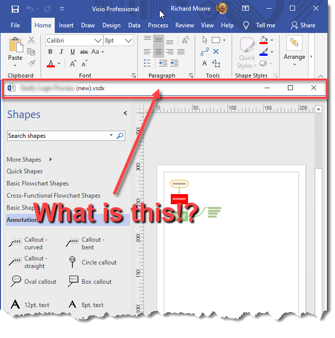
The other day (Feb 2020) I installed Visio 2019 on my new PC. I needed to do a flowchart for some legacy code I wanted to modify and re-factor. After opening a flowchart I noticed this:

I opened another Visio document and clicked on the View -> Window -> Cascade menu button and poof!
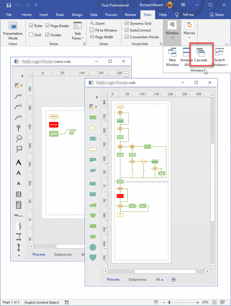
MDI!
Visio 2019 has an MDI user interface!
I can only presume that the Microsoft Devs didn’t code Office 2019 using WinForms, which suggests that they have either hand rolled their own MDI framework for their own internal use, or there exists an MDI framework from Microsoft that might one day be available to us mere mortals?
Even if this is a piece of internal Microsoft only code (it wouldn’t be the first time like the Office menu ribbons), it is still monumental in that someone at Microsoft has sat down at a meeting and said to the others, “You know what? We need an MDI user interface for this”.

And when the music resumed, they were all playing MDI ragtime.
